
Two newspapers, 58 years and 95 days apart.
The Globe and Mail – July 1, 1967
The front page is both ceremonial and confident:
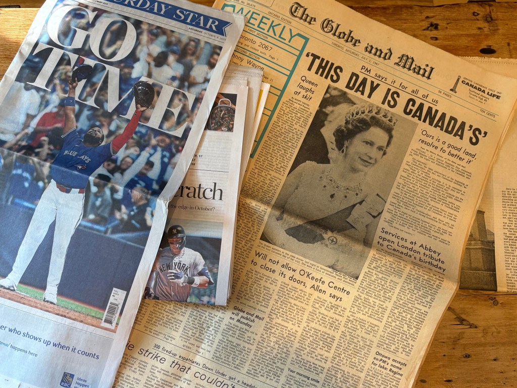
“THIS DAY IS CANADA’S”
PM says it for all of us
A black-and-white portrait of Queen Elizabeth II dominates the upper fold, a classic broadsheet composition. The typography is austere serif; authoritative but not loud. Below it, the sub-headline carries a sober optimism:
“Ours is a good land; resolve to better it.”
You can sense the mood of Confederation’s centennial – dignified, formal, and united in tone. The design language is about order: balanced columns, justified text, heavy headlines, narrow gutters. It is a product of hot-metal typesetting and a pre-offset world where precision cost time and skill. Every word was literally cast in lead.
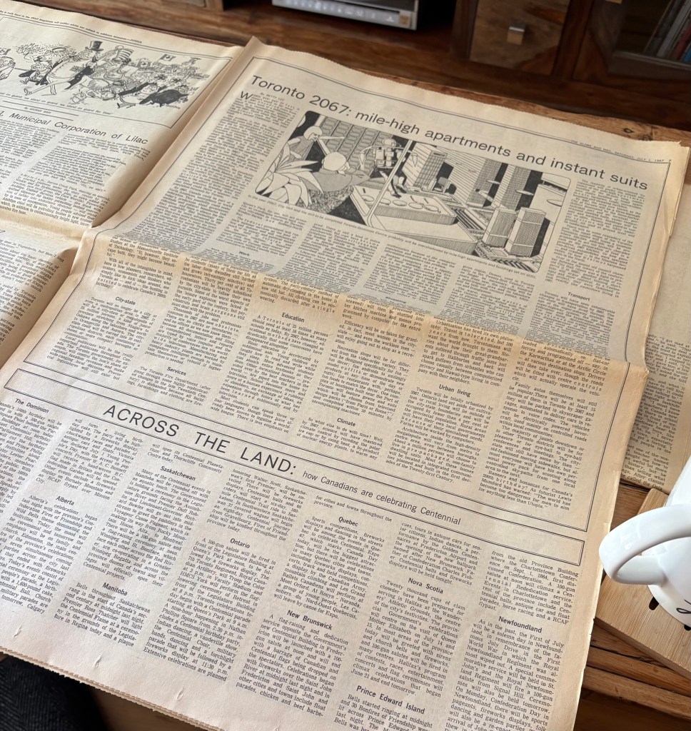
Even the surrounding stories reveal the priorities of a print-centred nation: a service at Westminster Abbey marking Canada’s birthday; theatre news about the O’Keefe Centre; Parliament stories laid out like civic inventory. The tactile rhythm of the paper – the slight crackle of newsprint, the faint acidy smell – gives a sense of occasion. The reader in 1967 was reading not just information, but ceremony.
The Toronto Star – October 4, 2025
Nearly six decades later, the Star opens with a full-bleed, full-colour photograph of a Blue Jays player with the exulting headline:
“GO TIME.”
The design is kinetic, image-forward, modern. Fonts are sans-serif, space is generous, photography bleeds to the edge. Where the 1967 Globe told the story through words, the 2025 Star tells it through image and emotion. It’s designed for the impulse buyer and the Instagram scroller alike: bold imagery that translates even when glimpsed across a café counter.
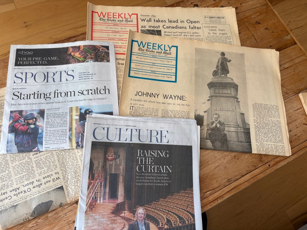
Inside, stories still reflect civic life – arts, politics, human moments – but the tone has become more conversational, less ceremonial and structured. The paper leans on visual hierarchy with photography, whitespace, colour cues, modular boxes. Yet it remains tactile: the ink rubs off, the fold creases. Amid the flood of screens, holding it feels like an act of deliberate attention.
Both papers have survived more than a century of reinvention.
The Globe and Mail has been around since 1844 and initially was the ‘voice’ of commerce in Toronto. Over time it has become Canada’s ‘business’ paper and it’s analogue evolution has included moving from letterpress to offset printing, with colour adopted in the 1980s. It would still be referred to as a ‘broadsheet’ paper nowadays; otherwise known as a newspaper with long, tall pages – an anchor for readers seeking depth in an era of speed.
The Toronto Star was founded in 1892 and began as a “working-class daily.” It has since evolved into Canada’s largest newspaper both by circulation and readership. The Star embraced photo-journalism early and shifted from street sales to subsrciptions as it evolved from full printing presses.
Both papers have developed a sense of trust in their physical editions. Even now, both the Globe and Star maintain print runs. They know that the printed page confers a permanence and deliberateness that digital cannot. Holding the 1967 issue connects you directly to a moment in time, not mediated by pixels. It’s a document you can age, see wear, smell, and see yellowing. It connects memory and material.
These two issues have become part of collective memory with their tangibility. The original print holds a material authenticity – the layout, the paper stock (heavier in ’67), the imperfections and its evident fragility… it’s a part of cultural record keeping.
The difference between these two papers – through tone and immediacy primarily – shows how the analogue form can host different values. It’s not that analogue forces one style; the form is flexible. But, paper forces you to choose – what makes the front page… what demands attention?
Among those, like me, who still buy print, each front page serves as a daily ‘theatre’ … a daily ‘this is what matters today’ presentation (editorial slants aside). …and, we know that this plays out globally. The Times of London, The New York Times, Le Monde, Asahi Shimbun share the paradox of being both disposable and archval. They record passing moments in a form meant to outlive it.
Across continents, analogue newspapers provide a civic mirror, a shared design discipline of retangular constraint, and a cultural ritual – often in the morning for me with a dark, black, extra hot coffee close by.
The 1967 Globe aligns with mid-century broadsheet archetypes; the post-war gravitas of the Times or the Washington Post. The 2025 Star fits the global 21st-century vernacular: photo-driven, emotionally charged, designed for repurposing across digital channels but still printed for those who crave touch.
Together, they trace the worldwide analogue lineage: the newspaper as both product and practice — a rhythm of days, of pages, of ink.
For The Analogue Press, these time-machines of ink and fibre are held up as models for our ethos – slowness as meaning (yesterday’s truth, already old – and therefore reflective), material permanence (folded, marked, torn – it resists deletion), shared physicality (it can be left on the table at the coffee shop for the next person to sit down), and a design of intention (each typeface, photo crop and layout line representing a human touch; not an algorithmic guess).
Both papers proclaim that history still needs surface and a desire to fix meaning in matter. That is The Analogue Press structure: permanence, texture, reflection, and the quiet rebellion of ink.

Leave a comment